library(ggplot2)
ggplot(iris) +
  aes(Sepal.Length, Sepal.Width, color = Species) +
  geom_point()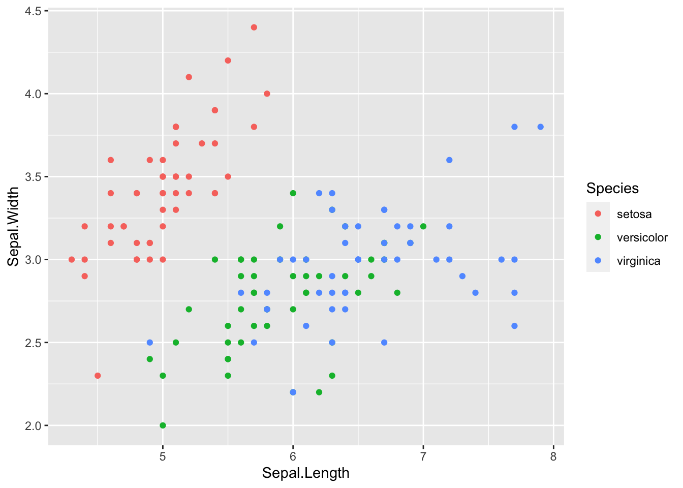
In this post I demonstrate how the ref.label knitr chunk option can be used to decouple code chunks and their outputs in xaringan presentations. I give two examples where this could be useful, namely by showing ggplot2 code and plots side-by-side on the same slide or by placing the plot output picture-in-picture style in the bottom corner of the slide.
You can see this technique in action in my presentation on ggplot2. Or you can download the R Markdown source for a minimal xaringan slide deck that demonstrates the whole process.
Update: Yihui Xie (the author of knitr and xaringan) pointed out on Twitter that another valid (and maybe better) option is to use knitr::fig_chunk(), and I’ve added a demonstration of that approach to this post. Honestly, if I had known about this function before, it would have been the centerpiece of this blog post!
A recent tweet by Gina Reynolds reminded me that I’ve been sitting on this blog post for a while.
{{ tweet EvaMaeRey 1029104656763572226 >}}
I learned a few xaringan tricks1 when creating my presentation on ggplot2 for the Tampa R Users Group, and hopefully this blog post makes it easier to replicate than digging through the messy source of that presentation.
To help teach the ggplot2 syntax, I thought it was important to see the code and the plot at the same time, side-by-side. Unfortunately, the standard appearance in R Markdown is for the code output to appear immediately following the code chunk that created it, like this.
library(ggplot2)
ggplot(iris) +
aes(Sepal.Length, Sepal.Width, color = Species) +
geom_point()
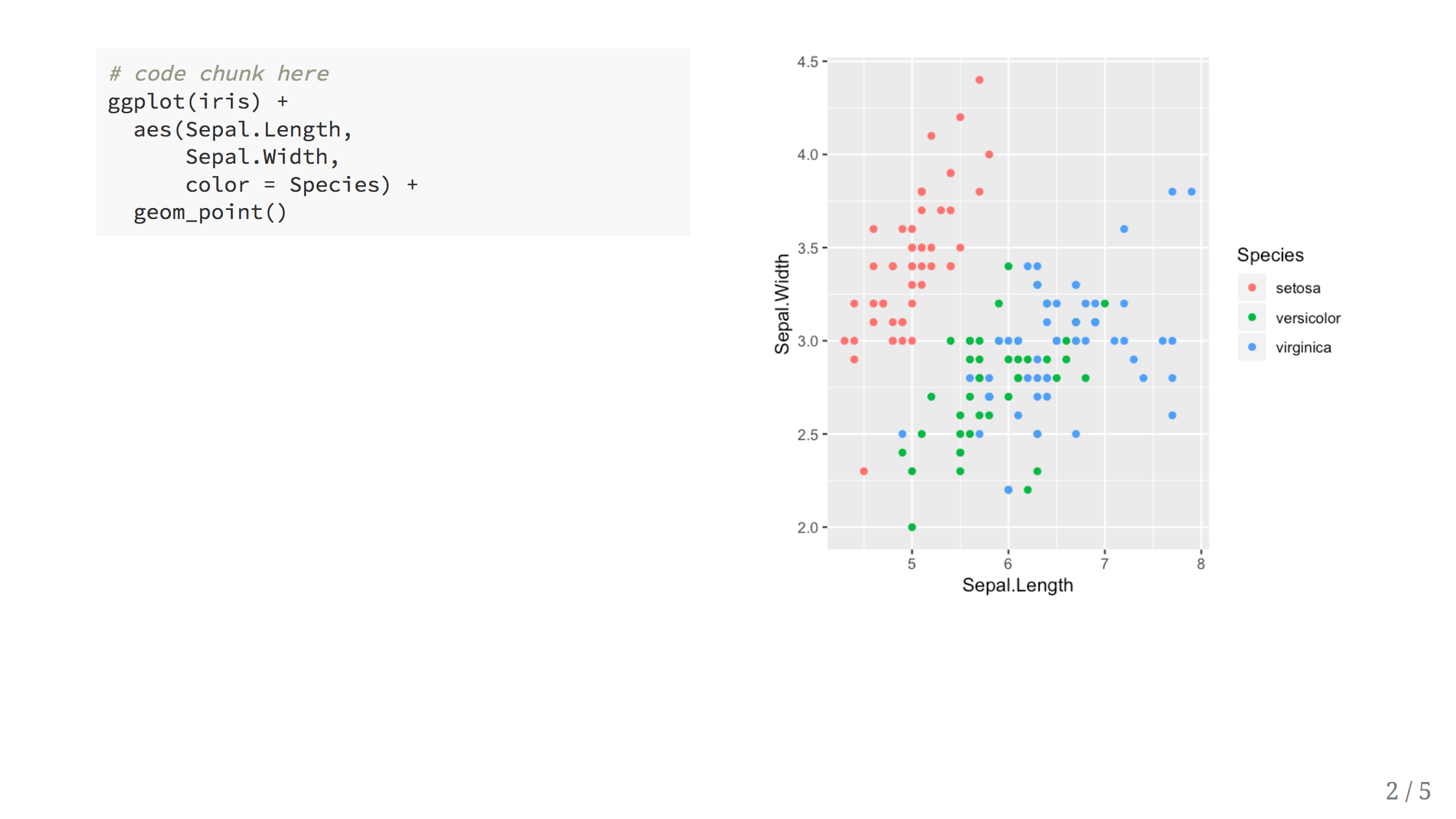
While this looks great on the web or in documents, you quickly run out of vertical space when presenting with the limited screen real estate of a wide-screen television. What I wanted were slides that look more like this:
Warning: `data_frame()` was deprecated in tibble 1.1.0.
ℹ Please use `tibble()` instead.
Warning: The `<scale>` argument of `guides()` cannot be `FALSE`. Use "none" instead as
of ggplot2 3.3.4.
In general, with xaringan, you use a two column layout by placing the left and right column content inside .pull-left[] and .pull-right[] respectively.
.pull-left[
```{r}
# plot code here
```
]

.pull-right[
Plot output here!
]
But the default action of knitr will place the plot output inside the .pull-left[] block, keeping it in the left column.
To solve this problem, we need to tell knitr to hold off on evaluating the code output and to place the results in a different chunk. We can accomplish this by setting eval=FALSE in the first chunk and using the ref.label code chunk option with echo = FALSE to output the result in the second:
.pull-left[
```{r plot-label, eval=FALSE}
# code chunk here
ggplot(iris) +
  aes(Sepal.Length,
      Sepal.Width,
      color = Species) +
  geom_point()
```
]

.pull-right[
```{r plot-label-out, ref.label="plot-label", echo=FALSE}
```
]
This works pretty well, but the plots ended up being somewhat squished, so I created two CSS classess for the left and right columns.
/* custom.css */
.left-code {
  color: #777;
  width: 38%;
  height: 92%;
  float: left;
}
.right-plot {
  width: 60%;
  float: right;
  padding-left: 1%;
}
I then used the following options in the YAML header of xaringan
output:
  xaringan::moon_reader:
    css: ["default", "custom.css"]
    nature:
      ratio: 16:9
and changed .pull-left[] ➡ .left-code[] and .pull-right[] ➡ .right-plot[].
.left-code[
```{r plot-label, eval=FALSE}
# code chunk here
ggplot(iris) +
  aes(Sepal.Length,
      Sepal.Width,
      color = Species) +
  geom_point()
```
]

.right-plot[
```{r plot-label-out, ref.label="plot-label", echo=FALSE, fig.dim=c(4.8, 4.5), out.width="100%"}
```
]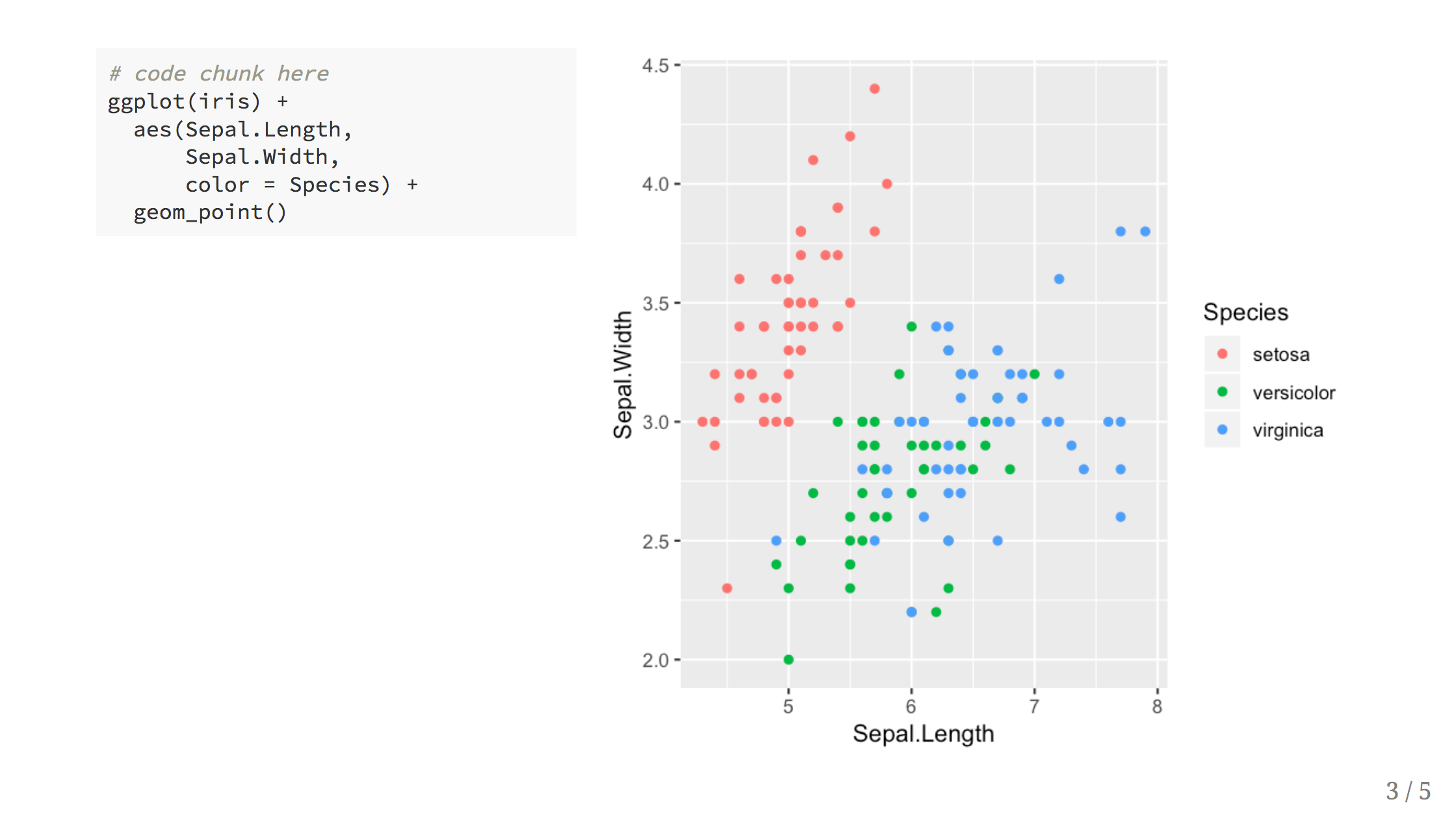
For best results, notice that I set the figure dimentions to 4.8 x 4.5 – and aspect ratio of approximately 9 / (16 * 0.6) – to match the .right-plot width in the CSS. I also added out.width="100%" so that the image is automatically scaled to fill the column width.
You can set this once in your setup chunk to apply these settings to all plots so that you don’t need to repeat yourself each time.
```{r setup, include=FALSE}
knitr::opts_chunk$set(fig.dim=c(4.8, 4.5), fig.retina=2, out.width="100%")
```The side-by-side layout works well when the code is small, but for a plot that requires longer blocks of code, I wanted to be able to see all of the code while still retaining the connection to the plot we were building up.
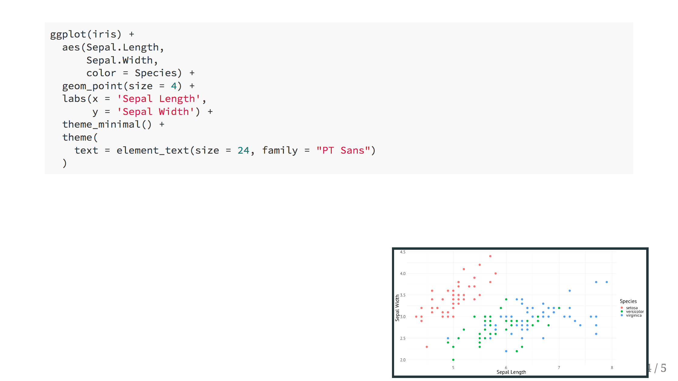
The inspiration for this layout is the “Picture in Picture” TV feature, where the changes to the plot appear in a small callout image in the slide to preview the changes at each step. Then, at the end, we can reveal the final plot in full screen.
The xaringan portion looks like this
```{r large-plot, eval=FALSE}
ggplot(iris) +
  aes(Sepal.Length,
      Sepal.Width,
      color = Species) +
  geom_point(size = 4) +
  labs(x = 'Sepal Length',
       y = 'Sepal Width') +
  theme_minimal() +
  theme(
    text = element_text(size = 24, family = "PT Sans")
  )
```

.plot-callout[
```{r large-plot-callout, ref.label="large-plot", fig.callout=TRUE}
```
]
The fig.callout=TRUE is a custom knitr chunk option I created that sets some default chunk values for the callout chunks so that I don’t have to repeat these every time I use this layout.
```{r setup, include=FALSE}
knitr::opts_hooks$set(fig.callout = function(options) {
  if (options$fig.callout) {
    options$echo <- FALSE
    options$out.height <- "99%"
    options$fig.width <- 16
    options$fig.height <- 8
  }
  options
})
```
And then finally, I used the following CSS to place the callout in the bottom right corner, set the size of the plot and style the plot image inside.
/* custom.css */
.plot-callout {
  height: 225px;
  width: 450px;
  bottom: 5%;
  right: 5%;
  position: absolute;
  padding: 0px;
  z-index: 100;
}
.plot-callout img {
  width: 100%;
  border: 4px solid #23373B;
}
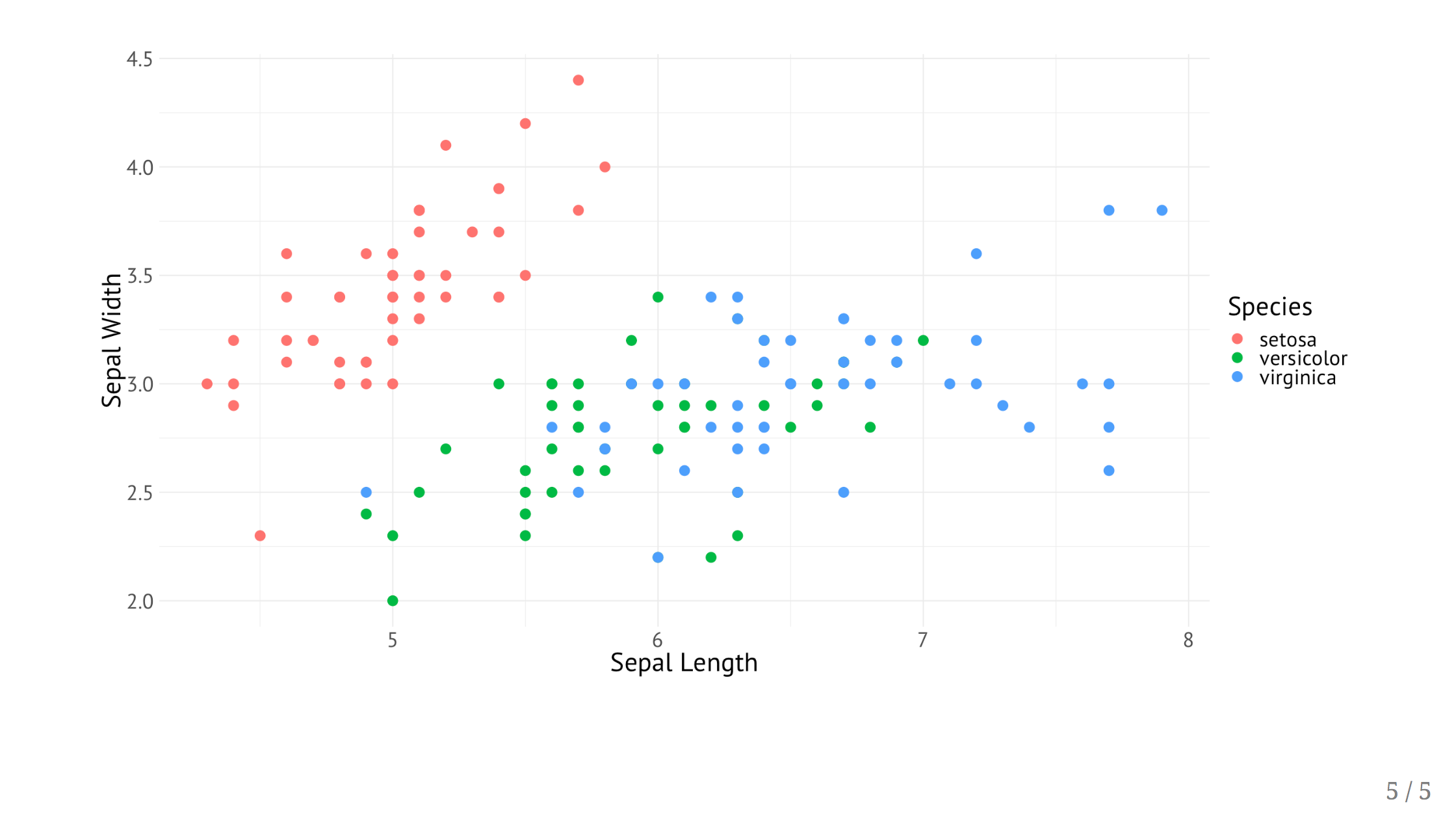
Then the final plot is revealed on the next slide using fig.callout=TRUE but without wrapping the result chunk in side .plot-callout[].
```{r large-plot-full-output, ref.label="large-plot", fig.callout=TRUE}
```
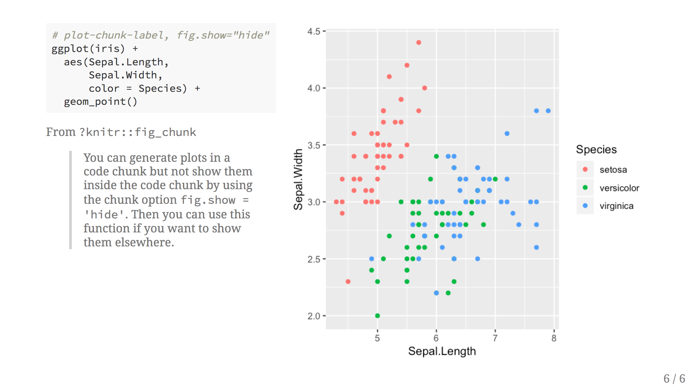
Yihui Xie pointed out on Twitter that we can use the chunk option fig.show="hide" for the source chunk and then call knitr::fig_chunk() directly wherever we want to embed the plot. What’s nice about this approach is fig_chunk() outputs the path to the image, so we are completely in control of how that image is embedded into our document.
He also wrote a helpful blog post about fig_chunk() where he describes his motivation for creating this function. (Spoiler alert: it is exactly the use case described in this blog post!) The help text for the function also helpfully describes our situation to a T:
This function can be used in an inline R expression to write out the figure filenames without hard-coding them. … You can generate plots in a code chunk but not show them inside the code chunk by using the chunk option
fig.show = 'hide'. Then you can use this function if you want to show them elsewhere.
.left-code[
```{r plot-label-fc, fig.show="hide"}
# code chunk here
ggplot(iris) +
aes(Sepal.Length,
Sepal.Width,
color = Species) +
geom_point()
```
]
.right-plot[
`)
]
If you want to see the whole process in action, I’ve compiled a minimal xaringan presentation that you can download and use as a starting point.
Let me know if this was helpful on Twitter at @grrrck and happy presenting!
Okay, really these are R Markdown and knitr tricks and if you want to learn more you should definitely check out R Markdown: The Definitive Guide.↩︎